Thursday, March 31, 2011

San Pellegrino Swapping Dresses -- oo la la

Photographed on my kitchen counter


Perhaps the tastiest, most refreshing and lovely water packaging company that exists (in my opinion) is San Pellegrino -- a mineral water brand that adds just a tad bit of carbonation when produced (made in San Pellegrino, Terme, in the Province of Bergamo, Italy). We store this sparkling water by the case at home and several weeks ago I came across a particular design which was unfamiliar to my knowledge of the brand. It looked as if the pattern was an intricate quilt—truly beautiful. I saved the bottle -- thought nothing of it. Ironically enough, today I read about a partnership between S.Pellegrino and Bvlgari. When I read it, I performed the whole talk in my head scenario "Bvlgari? Well why in the world? I wonder if the other bottle I found...Oh...Make sense now". The bottle I stumbled upon however, was an exclusive one made in partnership with the Italian clothing brand Missioni. This special sleeve was designed by the folks at Missioni and it proves to be just as sleek and just as beautiful as the Bvlgari bottle you see below. From dress to dress, this sparkling water brand is continuously going through diva transformations, especially when teamed up with Bvlgari on the limited edition bottle -- clearly stating they accept Bvlgari's invitation to mark the luxury jewelers 125 year anniversary.
http://carpediemclub.wordpress.com/2011/02/25/san-pellegrino-bulgari-bottle/


http://carpediemclub.wordpress.com/2011/02/25/san-pellegrino-bulgari-bottle/


For more info on this post check out:

http://carpediemclub.wordpress.com/2011/02/25/san-pellegrino-bulgari-bottle/

http://carpediemclub.wordpress.com/2011/02/25/san-pellegrino-bulgari-bottle/

Wednesday, March 23, 2011

Jeez Louise -- Who Made You So Fabulous?

According to Emerson --
"Every artist was first an amateur."


Thankfully right? Although that may be true in most cases, something happened when the design gods made Louise Fili -- she just may have been born fabulous, or something like that. Really, I have only familiarized myself with her work within these past 6 months, however. In these 6 months, I feel like something has drastically changed in my design aesthetic. I'm going to sound really strange right now but the only way I can describe it is in the following manner, now close your eyes:


It's spring.
You're lying on the grass and the sun is warm and the breeze feels good.
Baskets are beside you and they're filled with cheeses and white wines.
At the moment, you're eating 2 scoops of pistacchio.
And when you're done -- you'll have two more.
Every so often, children in white apparel skip by and tell you a joke
about your face looking funny or how they're responsible for
painting the sky such a pretty blue.
Oh and I forgot to mention, the sky is just the prettiest blue!
You welcome the silly-ness, the playfulness. 
You're in feel good mode.
Your boyfriend is playing Here Comes the Sun on his geee-tar.
You're happy and life is good.
You see lots of colors -- sometimes it's soft pinks and other times it's deep reds.
Stacks of poetry by Walt Whitman and Napoleon are by your feet.
Oh hey by the way, you're bear foot.
You'll start reading after you've had a total of 9 scoops.
It never gets cold and it's always warm.
Always happy.

If you don't believe me, just have a look for yourself.


And so, every time I view her work -- I feel this way and as a result, it becomes evermore beautiful. Her style? Refreshing. Her detail? Most admirable. Did I mention her love of that beautiful, beautiful country called Italy? Can I just faint now? She is wondrous in all the ways that one can be. I had the privilege of learning about her through a Professor* who told me I should consider looking through her work if I love design and Italy. Looking back, it's been both a blessing and a curse -- a blessing because the work is out of this world -- and a curse because I browse through it so much, her blog might as well become my homepage.

A presto,
Maria

Sunday, March 20, 2011

Doodle While You're Lost - ba ra ba ba ba ba ba!


I know you've done it too -- Gotten off the wrong subway stop. As a result you take the next stop. Go back several stops. Only to find you've been on the wrong line all along? Mercy. I'm guilty as charged. Yesterday I took the wrong train coming home from the Cooper Hewitt Museum while being engulfed in a rather engaging conversation with a friend.  All you need is an interesting plot and my ears are glued. Time? Who cares about the time! Until your friend's gone and you're the one stuck in Queensbridge -- with nothing but a bag full a beads, a 4 inch sketchbook and a few pastels at hand.

Here are a few skecthes inspired by Sonia Delaunay dearest while taking an extra lengthy train ride home. The sketches are quite adolescent but I do believe they carry a playfulness so greatly influenced by the beloved Sonia. Enjoy! -- Or not.

Kindest,
Maria

Saturday, March 19, 2011

Patterns, Colors and Shapes - Galore!


"Pssh -- who can do homework when there's a bead show in town?" My girlfriends and I dedicated the morning to rummaging through the aisles of Manhattan's annual bead show at the Metropolitan Pavilion. Thousands of jewels, bangles, beads and embroidered goods flooded the space. We couldn't think of any other way to top off the afternoon than taking a little visit to the Cooper-Hewitt National Museum for a viewing of Color Moves: Art and Fashion by Sonia Delaunay.  The work of the French-Ukrainian Sonia Delaunay can only be categorized by this: a swift movement of colors frolicking amongst geometric shapes. Oranges, reds, blues, yellows and greens categorize her abstraction. See below.

Pattern designs, 1928–30

To have witnessed the museum's second floor entirely dedicated to textile swatches -- is beyond me. Certainly there were sketches, clothing, curtains and paintings among the swatches but the real thief, that which stole the show, were the swatches themselves. I encourage each and every one of you to view her work. NOW. Her sense of pattern, negative space and color compatibility is what made Sonia wise before her years. Or maybe just her later years (Gossip: She married a gay German man by the name of Wilhelm Uhde for the sake of connections -- aka he owned an art gallery -- aka he wanted to keep his homosexuality on the hush hush. Through this marriage she gained popularity in the art world). Note how I mention HER years and HER work --  because yes, that's right -- for decades Sonia was better known for being the wife of painter Robert Delaunay than an artist herself. (Gossip: Comtesse de Rose often visited the Uhde's gallery and sometimes brought her son -- Robert Delaunay. Sonia met Robert Delaunay in 1909 which led to love which led to a divorce between her and Uhde -- how scandelous!). Love it!


I
'm wishing summer will come already! Sonia won't your paintings come to life?

For more information on this blog post check out:
http://cooperhewitt.org/EXHIBITIONS/color-moves/
http://www.nytimes.com/2011/03/18/arts/design/sonia-delaunay-show-at-cooper-hewitt-review.html


Till next time,
Mari

Friday, March 18, 2011

Italy -- America Adores You


Well because she is so fantastic, Rizzoli International asked graphic designer, typographer, lover of Italy and recipient of greatest female designer award on the Marissima blog -- Louise Fili -- to design the covers for Romanzi d'Italia, a series of ten amazing novels in honor of Italy's 150th anniversary! I have only read excerpts from 3 novels in my Italian Literature course-- but really, they should be read by all! Here they are:

 Le ultime lettere di Iacopo Ortis by Ugo Foscolo (with a preface by Paolo Mieli), Le mie prigioni by Silvio Pellico (Luciano Canfora), I promessi Sposi by Alessandro Manzoni (Andrea Riccardi), Le confessioni d'un italiano Ippolito Nievo (Sergio Romano), I Malavoglia by Giovanni Verga (Gustavo Zagrebelsky), Pinocchio by Carlo Collodi (Giovanni Belardelli), Cuore by Edmondo De Amicis (Pierluigi Battista), Il piacere by Gabriele D'Annunzio (Angelo Panebianco), I VicerĂ© by Federico De Roberto (Giovanni Sabbatucci) and Piccolo Mondo Antico by Antonio Fogazzaro (Ernesto Galli Della Loggia). Each volume is sold for 12 Euros.


Check out the interview in Italian! **Sorry English speaking people!**


Ps. Worthy post about the beloved Ms. Fili -- soon to come!


A presto,
Mari

Thursday, March 17, 2011

Buon Compleanno Italia

Poster I made for the 150th Anniversary -- Inspired by 1949 Olivetti Poster -- Giovanni Pintori


One hundred and fifty years ago today marks the unification of Italy. Today we celebrate the anniversary with waving flags, assorted sweets and a darn good orchestra orchestrating the national anthem. What we often forget is that the idea of a "united Italy" came fairly recently and Italians sometimes fail to regard themselves as "one" people. Thankfully today, we can proudly celebrate this beautiful country* (correction: some of us can proudly celebrate). Buon compleanno darling. Let the haters keep hating...

Please watch this beautiful video. Go ahead, be inspired or cry your eyes out. The type on the little boys soccer jerseys indicate the date of Italy's unification -- how sneaky, how clever, how beautiful.


Yesterday, during our History of Visual Communications class we observed propaganda art from all over the world; Germany -- London -- Russia -- U.S., etc. The idea of nationalism and zeal involved into serving ones country was inadvertently forced upon its people. In some way, I feel like this sweet and subtle video serves as the antithesis of that -- however, it still implies the same gesture of pride, nationalism and love for one's country. 

Till next time,
Mari

Tuesday, March 15, 2011

You Can Help

A poster I designed today for the cause, 2011


Hi everyone. I know the norm of my posts discuss food or social events, however. Tonight—tonight we need to buckle down and be serious. I'm not sure if you've noticed but, Japan's current situation is gruesome. Each day, thousands and thousands of bodies remain missing while more than 450,000 people have been displaced. The joy of being alive is short lived while survivors are now facing scarcity of food, water, medicine, and electricity. There is a risk that even worse is yet to come.

You can help in more ways than you think.

A call to all designers: create a digital poster or flyer and publicize through facebook, twitter, blogs or on campus. We have the power to educate. People need to be aware about the severity of the current situation in Japan. Use your skills and do something worthwhile, but more importantly, DONATE NOW. A dollar, ten dollars, one hundred dollars—anything. Imagine the world a family and Japan your brother. Help your brother. There is only so much rescue and relief workers can do to operate the toll of deaths and prevention.

I intern for a company called "caseable", which specializes in customized laptop cases. We are donating 25% of our sales from the Japan Relief Sleeve to the Red Cross in order to support the great efforts of the rescue teams. If you are interested in purchasing a sleeve please go to: http://www.caseable.com/share-gallery.php?productId=MzkxMw==


Sleeve I designed for caseable, 2011


Here are some trustworthy organizations worth donating money to.
For more information on this post and related topics, check out:
"Millions face worsening crisis in quake-hit Japan," Reuters, March 14, 2011
http://www.moveon.org/r?r=206964&id=26514-18758891-SpTsj3x&t=4
"Japan Faces Potential Nuclear Disaster as Radiation Levels Rise," The New York Times, March 14, 2011
http://www.moveon.org/r?r=206965&id=26514-18758891-SpTsj3x&t=5
Till next time,
Mari

Monday, March 14, 2011

Happy Belated Birthday!

www.thedieline.com


You've heard the expression before: 40... it's the new 30? Well, I'm not sure who is responsible for this nasty little lie but, it's exactly that: a lie. People, (including mermaids), should embrace their 40s! Especially when you're Starbucks. Happy belated birthday to YOU!

PS. I love your new logo.

Let's talk about this. The new Starbucks logo lacks text and to some people, that may not seem like a big deal, but to a designer, it really is. Lesson one in any marketing or design scheme: it's all about the brand name. It should be the most apparent piece of text on the package. I remember while designing sustainable wine boxes for a graphic production class last year, my Professor would pull the whole "Well if this is my company, WHY is my name the smallest text on the box? I love my company. Now make it bigger." Starbucks on the other hand, well, it's being quite the rebel. Maybe it's their ego or perhaps they really are trying to take a minimalist approach to their design. Either way, in  lieu of the well known "Starbucks" text, stands (well, floats right?) a poise little mermaid with long long locks and a sweet little smile.
www.thedieline.com


Do I think it's a bold move? Yes. Do I hate it? No. Do I love it? Well duh. It's refined, it's fresh, it's more stylized and simple but not boring—not boring is key. You can dislike it all you want but change is in my opinion, part of a company's growth. I know many people are considerably frusutrated with the look because it's not familiar to them, however. I've got news for you Debbie Downers: The coffee hasn't changed. So cheer up. Enjoy a cup. Enjoy your life. They even have little petite sized sweets for you thrifty weight watchers too! Rock on Starbucks (though I will admit, I'm NOT the biggest fan of your coffee).

Oooops?


For more info on this topic and more, check out:

http://www.nytimes.com/2011/03/13/business/13coffee.html?_r=1&scp=1&sq=starbucks%20logo&st=cse

http://blog.seattlepi.com/thebigblog/2011/03/08/new-starbucks-logo-debuts-on-companys-40th-anniversary/

Till next time.

Baci,
Mari

Wednesday, March 2, 2011

Yummy designs!

I've found my calling. It involves design and food. I know, you're all so surprised.
It's only 10:15 in the morning and I've already eaten a "lunch" meant for two; i.e.
(fresh mozzarella, prosciutto and melon, arugula salad with cherry tomatoes and
fennel, accompanied by several mountains of olives and crostini (no comment).
While browsing for recipes and food blogs, I came across one who's latest
post featured the title "Enter our competition to win a trip for two to Rome". How coud I NOT continue reading? Little did I know, I would eventually figure out where I want to be and what I want to design. http://www.carluccios.com/menus/blog

http://www.irvingandco.com/page8.htm

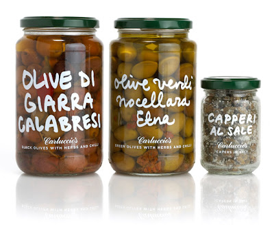
Check out this packaging. It's so beautiful it hurts. I find it rather ironic how
everyone usually hates the look of their own handwriting, but to someone else,
it's always uniquely beautiful. I introduce you to: Carluccio's. Antonio Carluccio
is an Italian chef, author, food lover and expert based in London. Many packaging
designs and Carluccio products are created by a London based studio named
"Irving & Co". The designs are exquisite. I'm talking about, so beautiful you need
to purchase a case of panettone even though we're nowhere close to Christmas.

http://www.irvingandco.com/page8.htm


I find their work to be considerably clean while paying particular attention to
detail. The designs scream modern Italy yet maintaining the tradition,
colors and beauty of what is so distinctively Italian. Confession: If I were a food
company, I would be manifested through Carluccio's branding aesthetic.
Not because my work is similar, but because I wish it was. There's an authentic
style to each food package while keeping an apparent consistency all
throughout. Carluccio's packaging is dreamy. "Nuff'said" (sorry, but always
keep in mind, I am from Astoria afterall)...

Here are some more images to have you drooling as well. Please enjoy!


http://www.irvingandco.com/page8.htm


http://www.carluccios.com/menus/blog


Baci.